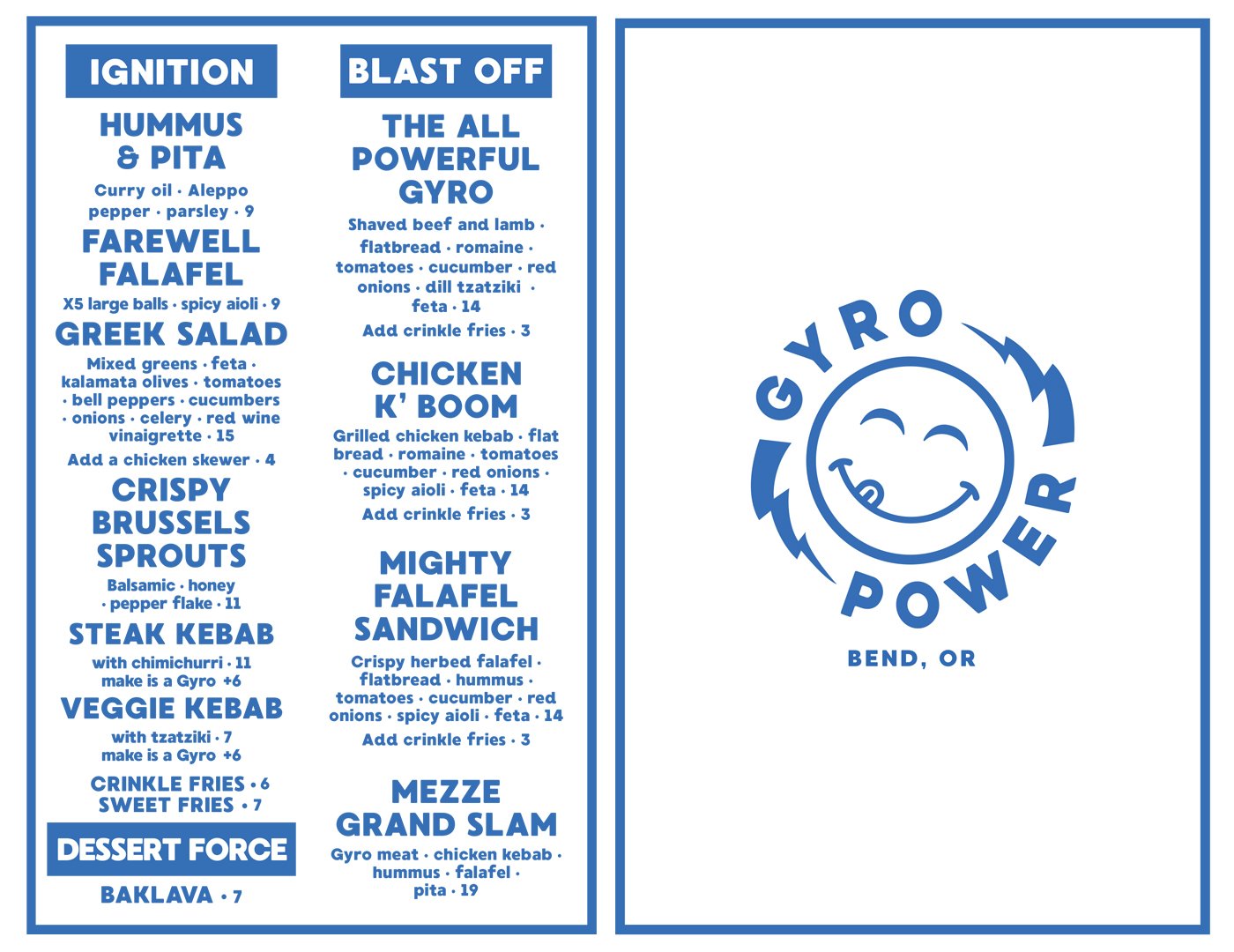
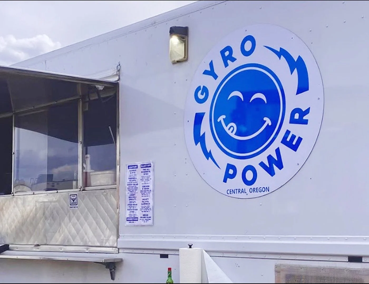
CLIENT | GYRO POWER
SERVICES | LOGO DESIGN
MENU DESIGN
Cliff and Sarah Abrahams, chefs and owners of multiple food
trucks and brick-and-mortar restaurants in Bend, Oregon, established "Gyro Power" as one of their food truck concepts.
This Greek-themed venture offers a menu including hummus, falafel, kebabs, and gyros. To align with the idea of their food as
a source of energy, they sought a logo that conveyed a dynamic and powerful feel.
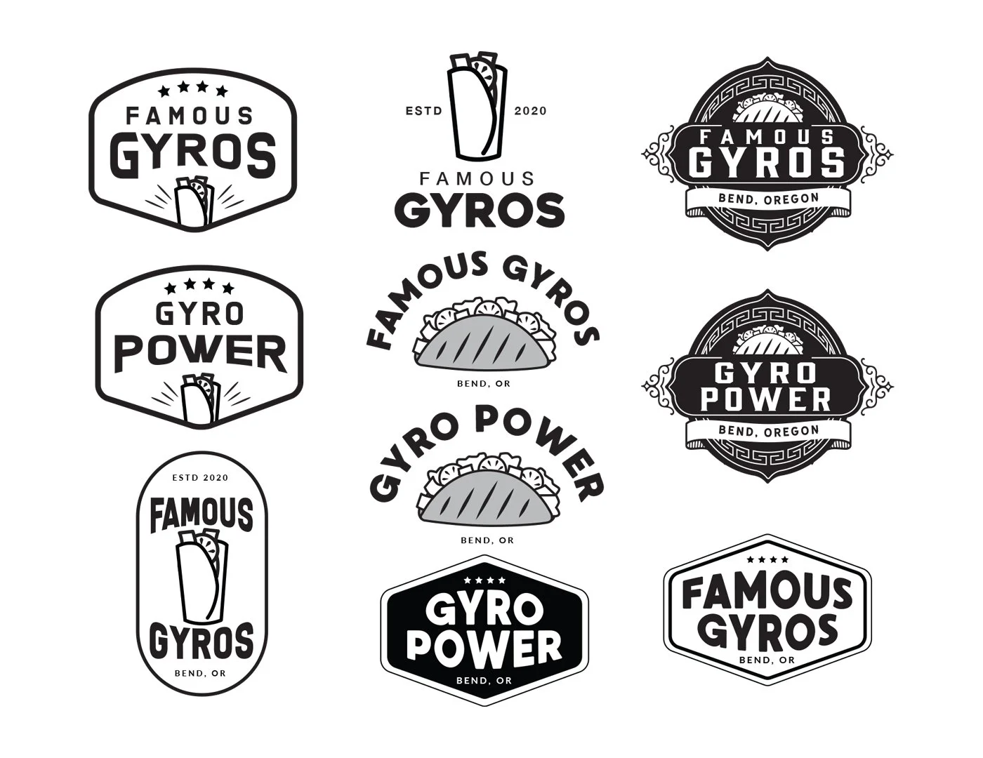
Ideation / Initial concepts
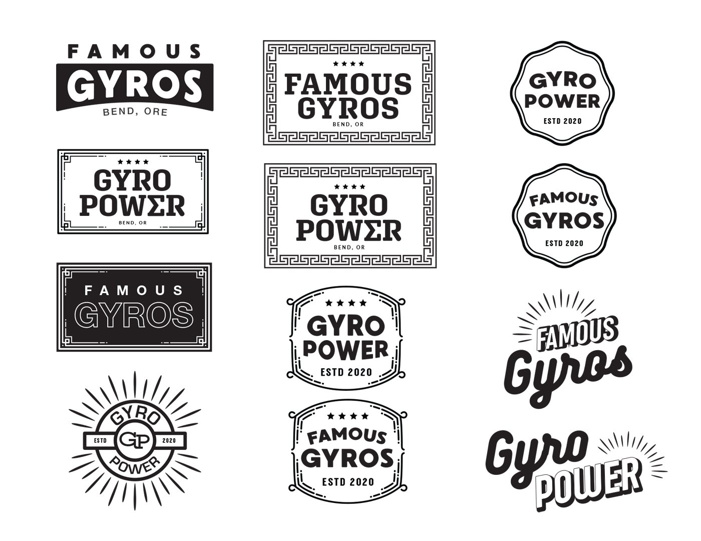
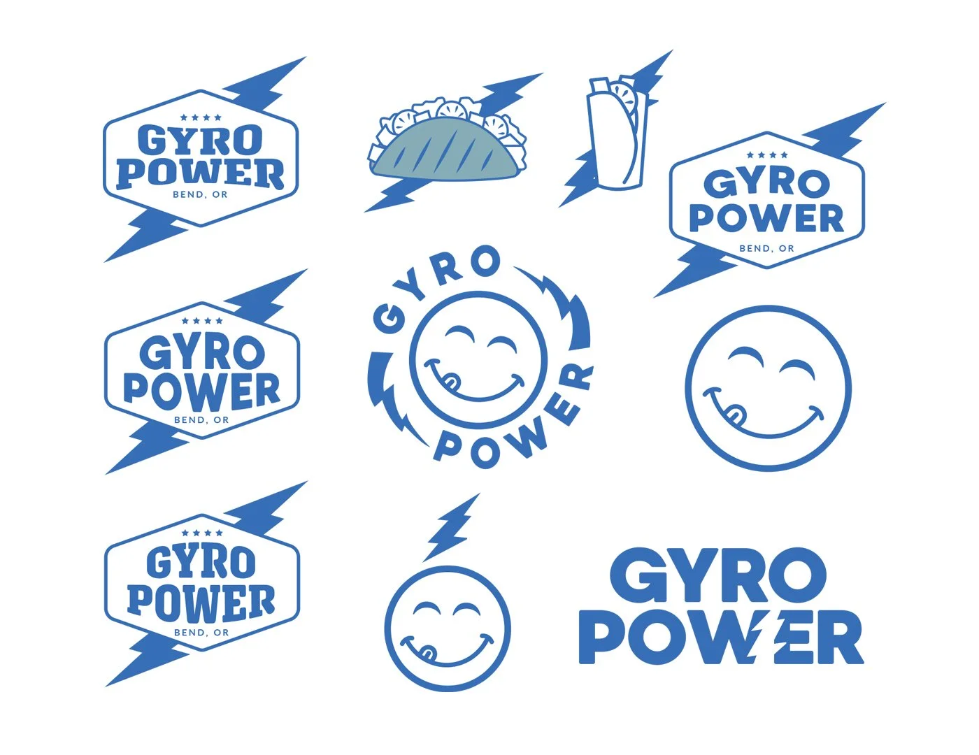
During the early stages, the Abrahams were still deciding on a name and offered several options for logo concepts. To guide my design process, I concentrated on the key tonal attributes they desired: energy, lightning, and power. My design explorations also involved integrating Greek-inspired patterns, investigating different logo container shapes, and experimenting with various typography choices.
Refinement
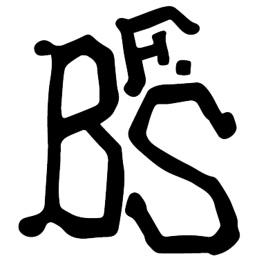
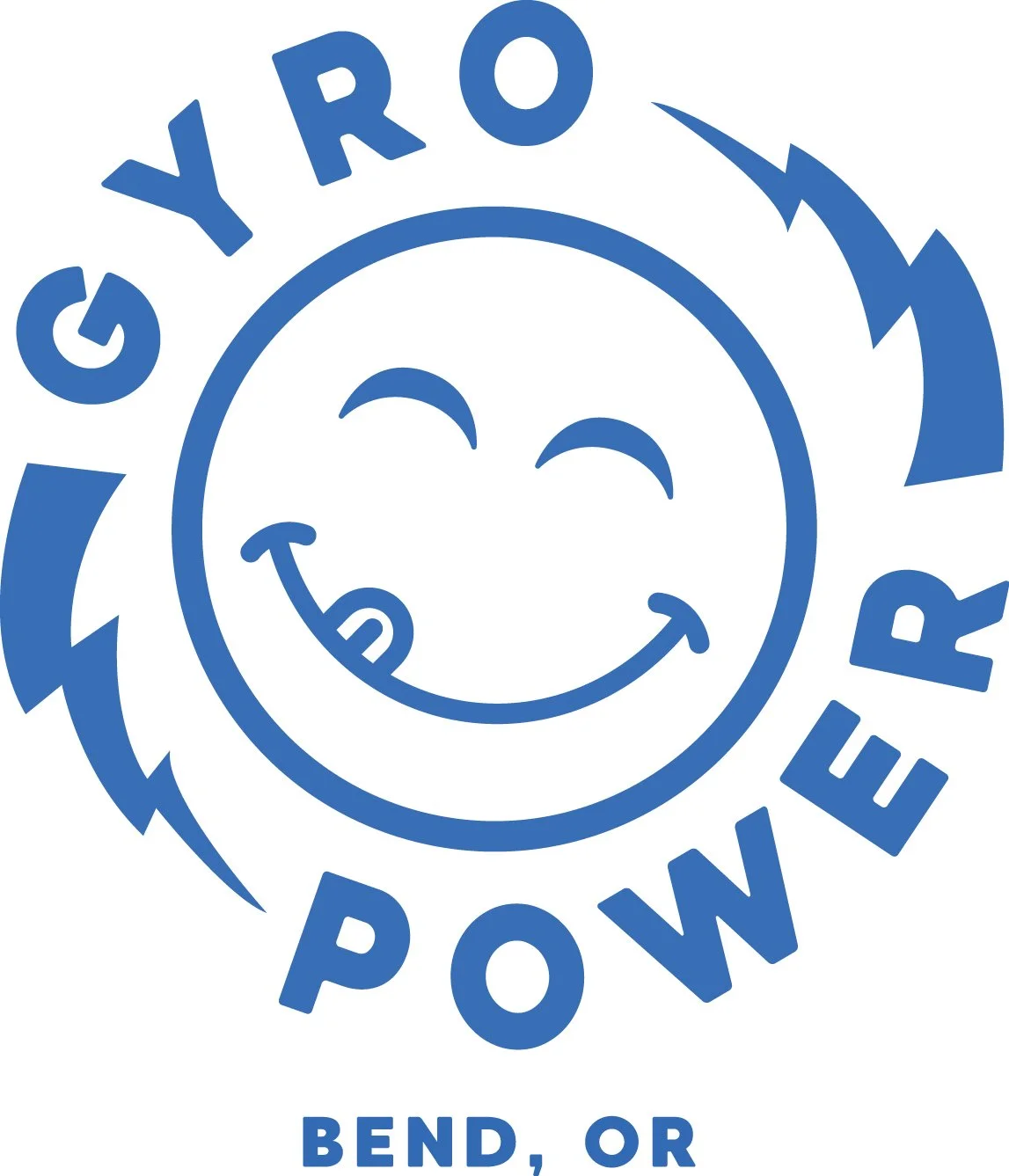
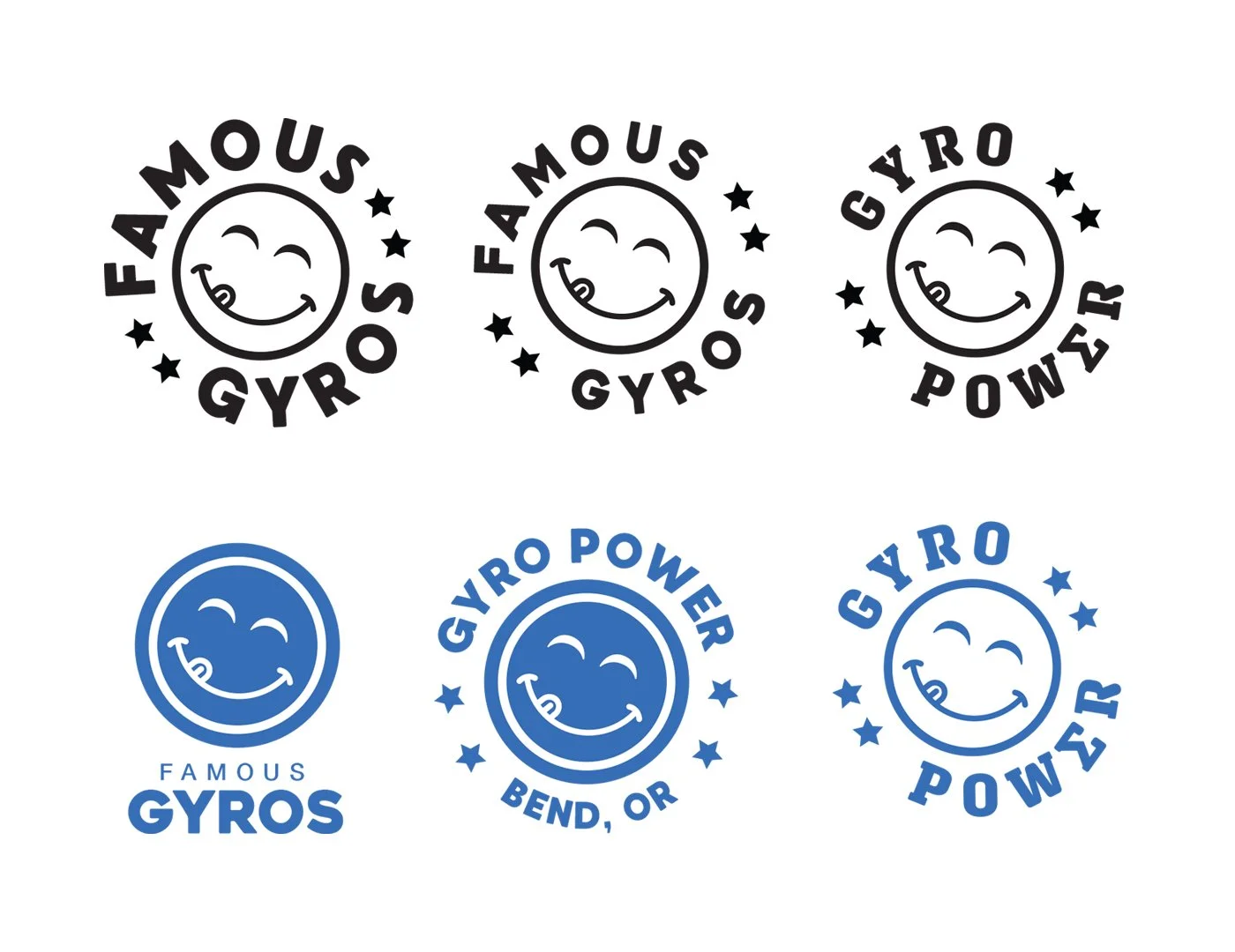
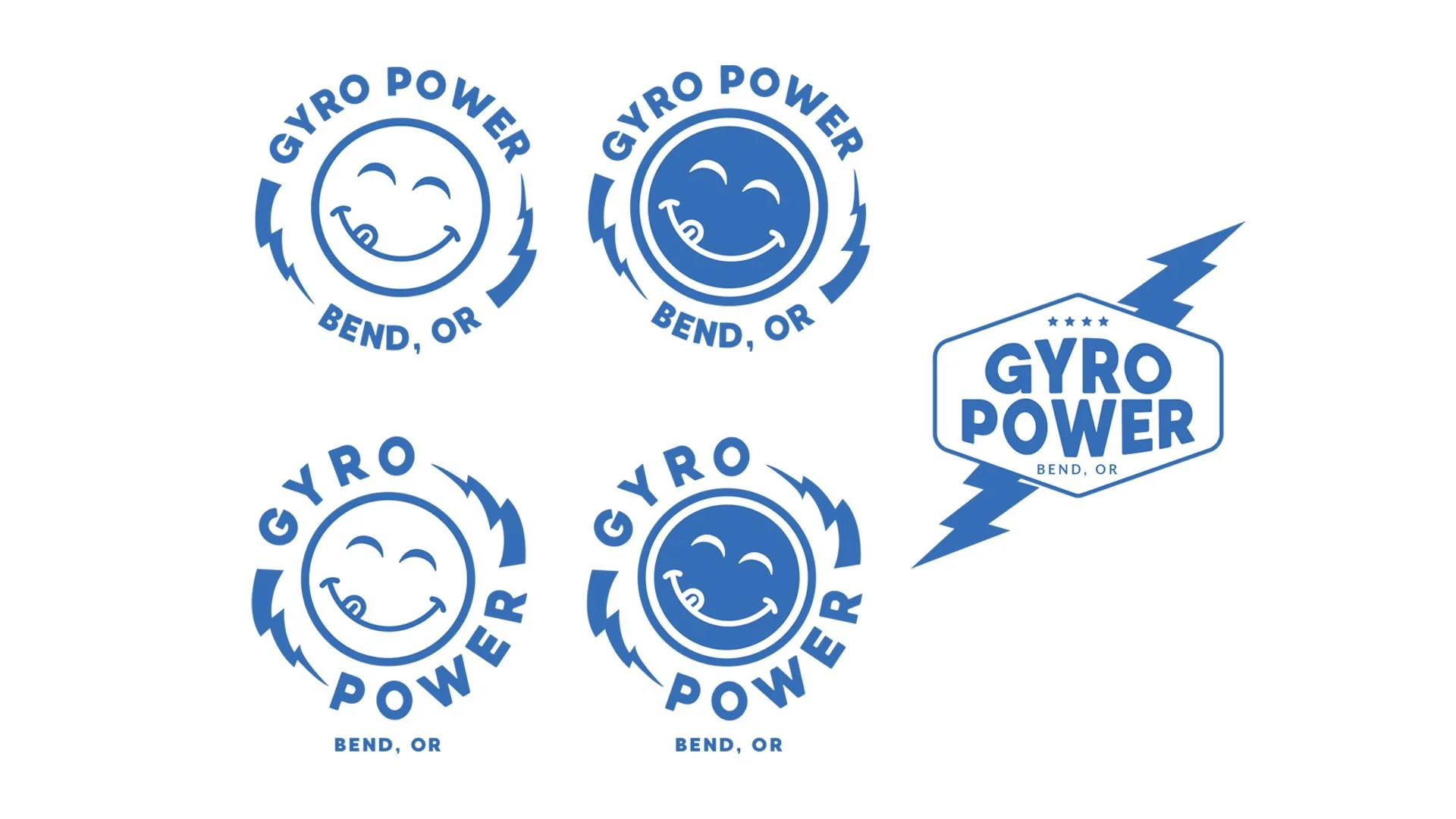
Once the Abrahams chose the name "Gyro Power" after reviewing the initial concepts, they expressed a preference for the playful "yum" face but also wanted to enhance the "power" aspect with the lightning bolt. My next step involved creating multiple design options that integrated the lightning bolt with the "yum" face in various type lockups. Furthermore, I developed a distinct second logo option inspired by the iconic superhero emblem, aiming for a strong and recognizable visual.
Final output
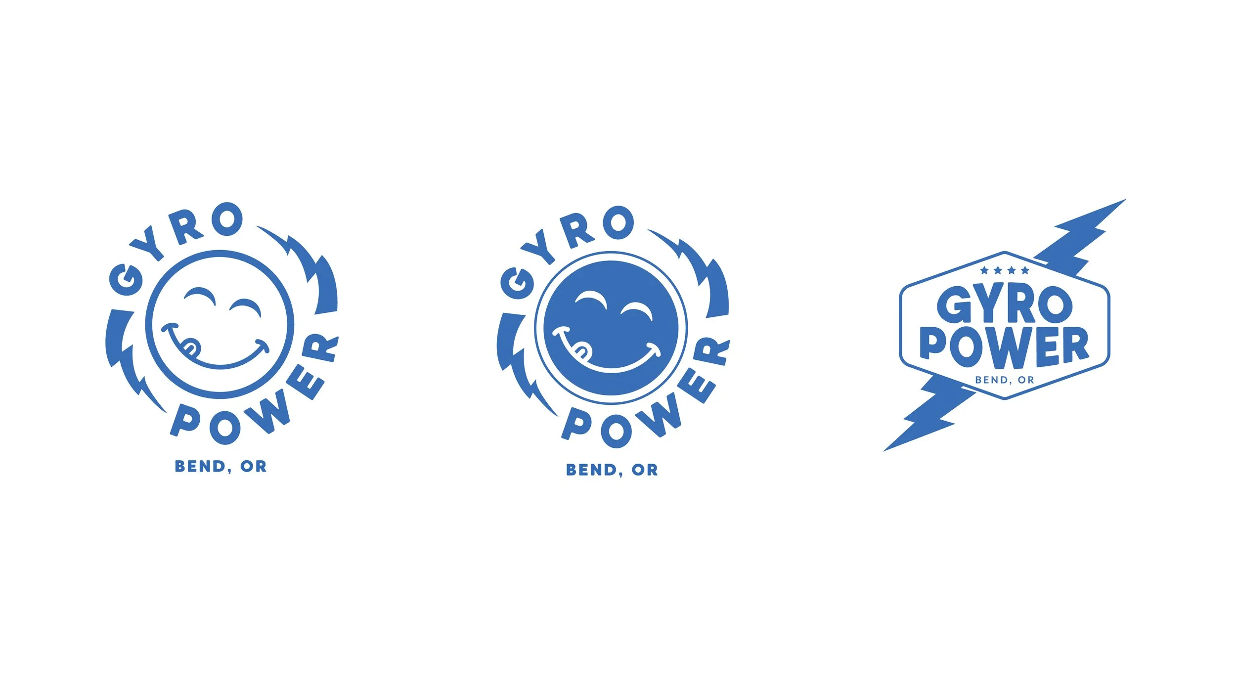
The Abrahams expressed great satisfaction with the updated designs, selecting one of the type lockups and all three logo options. The white and blue "yum" face logos were implemented in a variety of brand applications, alongside the secondary "superhero" logo. In addition to these, the final deliverables included a menu design. The "yum" face was also provided as a standalone element for marketing stickers and to seal their sandwich packaging.
